Contrast is a fundamental principle in art that involves juxtaposing opposing elements to create visual interest, depth, and emphasis. By understanding and applying various types of contrast, artists can guide viewers’ attention, evoke emotions, and convey meaning more effectively.
Understanding Contrast in Art
In art, contrast refers to the arrangement of opposite elements—such as light versus dark, rough versus smooth textures, or large versus small shapes—to highlight differences and create visual intrigue. This technique enhances the overall impact of a piece by emphasizing distinctions and drawing attention to specific areas. )
Types of Contrast in Art
Color Contrast
Color contrast involves using colors from opposite sides of the color wheel, known as complementary colors, to create vibrant and dynamic compositions. For example, pairing red with green or blue with orange can make each color appear more intense. This technique is evident in Vincent van Gogh’s “The Night Café,” where the juxtaposition of red and green enhances the painting’s emotional impact. )
Value Contrast
Value contrast refers to the difference between light and dark areas within an artwork. High value contrast can create a dramatic effect, as seen in Rembrandt’s “The Night Watch,” where the interplay of light and shadow directs the viewer’s focus to central figures. )
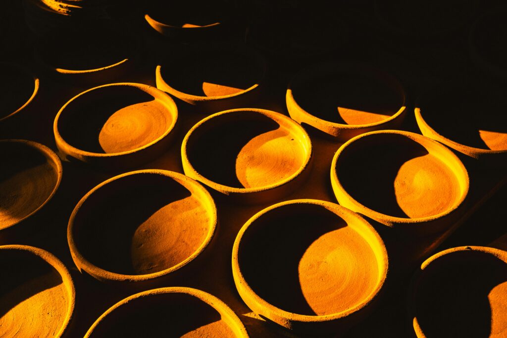
Texture Contrast
Combining different surface qualities, such as smooth and rough textures, adds tactile interest and depth to a piece. This contrast can make artworks more engaging by appealing to the viewer’s sense of touch. )
Shape and Form Contrast
Juxtaposing geometric shapes with organic forms creates visual tension and interest. For instance, placing angular structures alongside fluid, natural shapes can highlight differences and add complexity to the composition. )
Size and Scale Contrast
Varying the size and scale of elements within an artwork can emphasize importance and create a sense of depth. Placing a small object next to a much larger one can draw attention to the contrast and add visual intrigue. )
Techniques for Implementing Contrast
Chiaroscuro
Chiaroscuro is a technique that uses strong contrasts between light and dark to model three-dimensional forms and create a sense of volume. This method was notably used by artists like Caravaggio to add drama and depth to their paintings. )
Aerial Perspective
Also known as atmospheric perspective, this technique involves reducing contrast, detail, and color saturation in distant objects to create the illusion of depth. Leonardo da Vinci employed this method to depict vast landscapes with a realistic sense of distance. )
Juxtaposition
Placing contrasting elements side by side, such as warm and cool colors or smooth and rough textures, can create visual interest and highlight differences. This technique is effective in drawing the viewer’s attention to specific areas of the artwork. )
Examples of Contrast in Art
Caravaggio’s “The Calling of Saint Matthew”
This painting exemplifies the use of chiaroscuro, with dramatic lighting that highlights the figures and creates a sense of depth and realism. )
Mark Rothko’s “No. 61 (Rust and Blue)”
Rothko’s color field painting explores subtle contrasts between large areas of color, creating a contemplative and immersive experience for the viewer. )
Importance of Contrast in Art
Contrast serves several crucial functions in art:
- Visual Interest: It captures the viewer’s attention and prevents visual monotony.
- Emphasis: Contrast highlights focal points, guiding the viewer’s eye to important elements.
- Depth and Dimension: It creates the illusion of three-dimensionality on a two-dimensional surface.
- Emotional Impact: Contrast can evoke specific moods and emotions, enhancing the narrative of the artwork.
Common Questions About Contrast in Art
Why is contrast important in art?
Contrast is essential because it adds visual interest, directs attention, and conveys meaning within an artwork. It helps to create a dynamic composition that engages the viewer.
How does contrast create depth in art?
By using techniques like value contrast and aerial perspective, artists can simulate depth and three-dimensionality on a flat surface, making the artwork more lifelike.
Can contrast be used in all art forms?
Yes, contrast is a versatile principle applicable across various art forms, including painting, photography, sculpture, and graphic design.
What is the difference between contrast and emphasis in art?
While contrast involves juxtaposing different elements to highlight differences, emphasis focuses on drawing attention to a specific area or subject within the artwork. Contrast can be a tool to achieve emphasis.
How can beginners practice using contrast in their art?
Beginners can start by experimenting with simple exercises, such as creating compositions with high and low value contrasts, using complementary colors, or combining different textures and shapes to observe their effects.
By mastering the use of contrast, artists can enhance the visual impact of their work, create compelling compositions, and effectively communicate their intended messages to the audience.